

When it comes to building a website that performs, design isn’t just about making things look good—it’s about understanding human behaviour. That’s where psychology comes in.
Every element on your website sends a message. From the colour of your buttons to the placement of your content, your design choices influence how users feel, think, and act. Good design isn’t just about aesthetics—it’s about crafting a smooth, intuitive experience that guides visitors exactly where you want them to go.
Your users make split-second decisions when they land on your site. They decide whether to stay or bounce, click or scroll, buy or leave. If your design isn’t built around how people actually think and behave, you’re leaving conversions on the table.
By applying psychological principles to your web design, you can guide user behaviour, boost conversions, and create an experience people actually want to engage with.
Let’s explore five proven psychological principles you can use right now to level up your website design and keep users coming back for more.
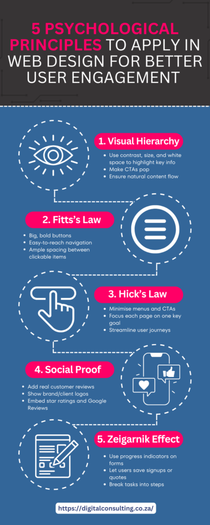
1. The Principle of Visual Hierarchy
Your brain loves order. When users visit a site, they subconsciously scan for structure and meaning. That’s why visual hierarchy is a game-changer in web design.
Emphasise what matters by making smart use of contrast, proportional layout, colour hierarchy, and white space. Headlines should grab attention, CTAs (calls to action) should pop, and supporting content should flow naturally from top to bottom.
A strong visual hierarchy ensures users don’t get overwhelmed. Instead, they instinctively know where to look and what to do next—whether that’s reading a blog post or booking a service.
💡Pro tip: Pair visual hierarchy with bold, contrasting CTAs like “Request a Free Quote” to increase clicks.
Need help structuring your site for maximum impact? Let us help you to ensure everything functions smoothly behind the scenes, too.
2. The Fitts’s Law Principle
Fitts’s Law says that the time it takes to move to a target area (like a button or link) depends on its size and distance. In simple terms: make clickable elements big and easy to reach.
Think about your mobile users. If your navigation menu is too small or your form buttons are cramped, people will bounce.
Here’s what to do:
-
Increase button size on mobile
-
Leave enough spacing between clickable elements
-
Make your primary CTA button stand out from the rest
Small tweaks, big wins. You want users to take action? Make it ridiculously easy for them.
3. The Rule of Hick’s Law
Here’s a truth bomb: More choices = more confusion. Hick’s Law states that the more options you present to a user, the longer it takes them to decide.
If your homepage has 10 different CTAs, 4 menus, and a carousel of images fighting for attention—you’re losing people.
Streamline your navigation. Prioritise the journey you want your users to take. Focus on one key action per page, whether it’s:
-
Submitting a form
-
Reading an article
-
Purchasing a product
4. The Principle of Social Proof
Humans are wired to follow the crowd. If we see others using or endorsing a service, we’re more likely to trust it.
That’s why testimonials, case studies, ratings, and trust badges are so effective. They build instant credibility.
What can you add to your website today?
-
A scrolling section of customer reviews
-
A “Trusted by” logo bar with partner/client brands
-
Star ratings for products or services
-
Google Reviews embed via your Google Business profile
Don’t underestimate the power of real voices. Social proof isn’t fluff—it’s conversion fuel.
5. The Zeigarnik Effect
Ever started something and couldn’t stop thinking about it until it was done? That’s the Zeigarnik Effect. It suggests that incomplete tasks stick in our memory more than those we’ve finished.
This is gold for engagement. Use this principle to nudge users toward taking the next step.
Here’s how:
-
Use progress bars in multi-step forms
-
Let users save their progress on quote requests or signups
-
Break longer processes into bite-sized steps
For example, instead of a long one-page form, show “Step 1 of 3”—it feels lighter, and users are more likely to follow through.
Final Thoughts: Design for the Mind, Not Just the Eyes
The best websites aren’t just pretty—they’re psychologically smart. By tapping into these core principles, you’ll not only impress your visitors but keep them engaged, reduce bounce rates, and increase conversions.
Whether you’re designing from scratch or revamping an existing site, remember: psychology is your secret weapon.
💬 Ready to apply these psychological principles to your website?
Let our team at Digital Consulting help you create a user-focused, conversion-driven design.
📧 Contact us today and let’s build something that works as beautifully as it looks.
Related services you might find helpful:
Let’s design with purpose.


