

Table of Contents
For over a decade, minimalism has dominated digital design. Clean layouts, white space, and “less is more” became the gold standard for modern websites.
But in 2026, things are shifting.
Design is getting louder, messier, more human—and intentionally imperfect.
Welcome to the rise of anti-design. What is it you might be wondering?
This article breaks down the evolving battle between anti-design and minimalism, why imperfection is suddenly appealing, and how businesses can use both styles strategically (without killing conversions).
1. Why Minimalism Took Over the Internet in the First Place
Before we talk about anti-design, we need to understand why minimalism became so dominant.
Minimalist web design focuses on:
- Simplicity
- Clarity
- Fast performance
- Strong user experience
It removes distractions so users can focus on key actions—like clicking a button or filling out a form.
That’s why industries like SaaS, finance, and corporate services still rely heavily on it. It builds trust and makes navigation effortless.
Why it worked so well:
- Faster load times (great for SEO)
- Clear messaging
- Mobile-friendly layouts
- Better accessibility
If you’re targeting search visibility, this still matters a lot. That’s where strategies like AI Search Optimization come in, combining UX and SEO for better rankings.
But here’s the problem…
2. The Rise of “Minimalism Fatigue”
Minimalism didn’t fail; it got overused.
When every website looks the same, same layouts, same fonts, same spacing, you lose differentiation.
This is often called “blanding” or “bland brand syndrome”.
Designers and users alike are noticing:
- Everything feels templated
- Brands are losing personality
- AI-generated layouts are making sameness worse
In fact, the rise of automation tools has accelerated this problem, with many sites defaulting to nearly identical structures and visual patterns.
Translation: Clean doesn’t always mean memorable anymore.
3. What Is Anti-Design (and Why Is It Trending)?
Anti-design is exactly what it sounds like:
Breaking traditional design rules on purpose.
Think:
- Clashing colors
- Asymmetrical layouts
- Overlapping elements
- Raw or “unfinished” visuals
- Experimental typography
It’s heavily inspired by:
- Brutalism
- 90s/Y2K nostalgia
- DIY/handmade aesthetics
But it’s not random chaos.
It’s controlled imperfection.
Designers are intentionally breaking the grid to create something more expressive and human.
This trend is part of a broader movement away from polished, sterile digital experiences toward more tactile, emotional design.
4. Why Imperfection Feels More “Human” in 2026
Here’s the real reason anti-design is exploding:
People are already tired of AI-perfect everything.
With AI tools generating:
- Logos
- Websites
- Content
- Layouts
…the internet is becoming too polished.
So brands are responding by doing the opposite:
- Adding texture
- Showing flaws
- Using hand-drawn elements
- Breaking alignment rules
This creates:
- Authenticity
- Emotional connection
- Memorability
In short:
Perfect = generic
Imperfect = human
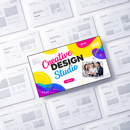
5. Anti-Design Is a Rebellion Against AI-Generated Sameness
AI has changed design workflows, but it’s also created a new problem:
Homogenisation
When tools are trained on existing patterns, they reproduce what’s already popular.
That’s why so many websites now:
- Look similar
- Use the same layouts
- Feel interchangeable
Anti-design pushes back against this.
It says:
“Let’s create something AI wouldn’t generate.”
This is especially important for branding.
Because if your website looks like everyone else’s…
You’re invisible.
6. Minimalism Isn’t Dead, It’s Evolving
Here’s where most people get it wrong:
Minimalism isn’t going away.
It’s just evolving.
In 2026, minimalism looks more like:
- Warm, natural colour palettes
- Subtle textures
- Softer layouts
- More personality
Designers are moving away from cold, sterile interfaces toward something more inviting and human.
Even reports show that strict, all-white minimalism is fading in favour of richer, more expressive design styles.
The new version of minimalism:
- Still clean
- Still functional
- But less “soulless”
Think of it as: Minimalism with character
7. The Middle Ground: “Controlled Chaos” (Soft Maximalism)
Most brands won’t go full anti-design, and they shouldn’t.
Instead, the sweet spot in 2026 is something called:
Controlled chaos
This means:
- Bold visuals + structured UX
- Expressive branding + clear navigation
- Creative layouts + usability
Designers are combining:
- Maximalist visuals
- Minimalist functionality
Because at the end of the day:
If users can’t navigate your site, nothing else matters.
8. Anti-Design vs Minimalism: Key Differences
Here’s a simple breakdown:
Minimalism
- Clean and structured
- Focus on usability
- Limited colour palette
- Grid-based layouts
- High performance
Anti-Design
- Experimental and expressive
- Breaks traditional rules
- Bold colours and typography
- Asymmetry and layering
- Focus on identity
Neither is “better.”
They just serve different goals.
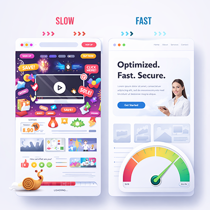
9. When to Use Minimalism (Still the Smart Choice)
Minimalism is still the best option if your goal is:
- Lead generation
- Conversion optimisation
- Professional credibility
- Clear communication
Industries where minimalism wins:
- Law firms
- Finance
- Healthcare
- B2B services
If your website needs to convert quickly, keep it simple.
If you’re unsure, check out our SEO guide for strategies that balance design and performance.
10. When to Use Anti-Design (To Stand Out)
Anti-design works best when your goal is:
- Brand awareness
- Creativity
- Differentiation
- Emotional engagement
Perfect for:
- Creative agencies
- Fashion brands
- Startups
- Personal brands
If your brand thrives on personality…
👉 Anti-design can make you unforgettable.
11. The SEO Impact: Does Design Style Affect Rankings?
Short answer: Yes, but indirectly.
Google doesn’t rank “minimal vs anti-design.”
It ranks:
- User experience
- Page speed
- Engagement
- Content quality
Minimalism naturally supports SEO because:
- Faster load times
- Clear structure
- Better accessibility
Anti-design can hurt SEO if done badly, especially if:
- It slows down the site
- Confuses navigation
- Buries key content
The goal is balance:
- Creative design
- strong UX
- SEO fundamentals
12. The Real Trend in 2026: Emotion-Driven Design
The biggest shift isn’t minimalism vs anti-design.
It’s this:
Design is becoming emotional again.
Websites are no longer just functional tools.
They’re:
- Experiences
- Brand stories
- Identity statements
We’re seeing:
- Bold typography
- Layered storytelling
- Interactive elements
- Personalisation
All driven by one goal: Make users feel something
13. How to Choose the Right Style for Your Business
Here’s a simple framework:
Choose Minimalism if:
- You want clarity
- You need conversions
- Your audience values trust and simplicity
Choose Anti-Design if:
- You want to stand out
- You’re building a bold brand
- You want emotional engagement
Or combine both if:
- You want performance + personality
This hybrid approach is where most successful brands are heading.
14. Practical Tips to Apply This to Web Design in 2026
You don’t need a full redesign to adapt.
Start with:
Add personality to minimalism:
- Use stronger typography
- Introduce subtle textures
- Add micro-interactions
Add structure to anti-design:
- Keep navigation simple
- Use clear CTAs
- Maintain readability
Focus on what matters:
- User experience first
- Branding second
- Trends last
15. Final Thoughts: Imperfection Is the New Advantage
In 2026, the most powerful design shift is this:
People trust what feels real.
Minimalism gave us clarity.
Anti-design gives us character.
The winning formula?
Clarity + personality
Because in a world of AI-generated sameness…
The brands that feel human will win.
Need Help Finding the Right Balance?
If you’re not sure whether your website should lean minimal or experimental, it’s worth getting expert input. Because great design in 2026 isn’t about trends; it’s about what works for your audience.


